You want your resume to look perfect so you can be confident that you’ll make a good first impression. Using a special font is one of the ways to achieve this goal, but it’s easy to get carried away with creativity.
Since many companies use automated applicant tracking systems that may have a problem with unconventional fonts, you need to be very careful when choosing a resume font.
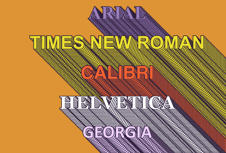
Table of Contents
What is the best font for a resume?
There is no single answer to this question, as there are quite a few fonts that look professional and work well with ATS. The resume font style you choose may depend on the type of job you are applying for and the kind of an impression you are looking to make.
However, one thing is clear: the font must be readable. Never choose a cursive or another font that is difficult to read as your resume will most likely immediately get skipped. Luckily, there are many fonts that were specifically designed to be easy on the eyes.
Here are some of the best fonts you can choose from
Times New Roman
This is the ultimate classic font. It is traditional and immediately gives your resume a professional look.

Georgia
Georgia looks very similar to Times New Roman, however people find it easier to read due to it being a bit wider. It will also give your resume a professional, formal look, which is great for industries such as finance and business.
Arial
Another classic, recognizable font. Often used for web design and branding, it is a solid choice for most people, especially those applying for design or advertising jobs.
Calibri
Calibri was designed to be easy to read and have a friendly appearance. It has been Microsoft’s default font since 2007, so you definitely don’t need to worry about it being unusual.
Helvetica
This font was made to look neutral but elegant, which is great for resumes. It is neither too formal nor too casual, adding just a bit of character without trying too hard.
Trebuchet MS
This font manages to stand out but still remains clear and readable. This means it can be a great choice for more creative fields. Alternatively, it can be used by job hunters who don’t have much experience, as it fills a page more quickly due to its thickness.
Verdana
Verdana was designed to be easy to read on screens even in smaller font sizes. You can use it if you want to squeeze as much text as possible in your single page resume, but don’t overdo it as tiny text can be frustrating to read.
Tahoma
Tahoma is similar to Verdana, but more narrow and with tighter spacing, so you will have to use a larger size to make sure it’s easy to read. It is recommended for job seekers in technical fields.
Cambria
Cambria was made to be easy to read both on computer screens and when printed out. It has a business feel, which makes it perfect for those in the corporate world. However, it may seem too serious and monotonous for a more creative job position.
Book Antiqua
Inspired by Renaissance era calligraphy, Book Antiqua will give your document a classical art feel. This makes it a great choice for people looking for work in graphic design, theater or other artistic fields.
To choose a font, you can simply test them out by changing the font of your whole resume document to see what kind of impression each one gives off. If you’d like, you can also ask your friends for their opinion. All of these fonts are designed to be readable, so choosing between them is simply a choice of style and what feels appropriate for the job you are applying for.
Choosing your resume font size
After choosing your font, you also need to think of its size in your resume. While typing up your document on your computer, you may be getting a false sense of what it will look like when printed out. A font that is too small will force hiring managers to strain their eyes trying to read, making it likely that they will simply skip your resume. On the other hand, a font that is too large can make your document look like a children’s book, or come off as if you were simply trying to fill the space on a page.
While a point size of 12 works well for most fonts, it depends on the specific font you chose. In order to choose the right size, it is best to try a few and compare them. Make sure you are looking at the document without zooming in or out, but rather have it set to 100% zoom. Then try different point sizes starting from 10 then going up to 14 to see which one looks best.
Additionally, don’t forget about spacing. If you leave the document single spaced, it may seem crowded and difficult to read. Double spacing can work for short resumes, however if you have a longer one, this will likely stretch it out to be more than one page long. 1.5 spacing can be a good, neutral choice for a resume. Again, try different options and see what is most appealing to the eyes.
Conclusion
At the end of the day, the content of your resume is still what will get you the job. However, not paying any attention to fonts can cost you lost opportunities. It’s best not to rush and to simply dedicate a bit of time to trying different resume fonts and sizes before you submit your resume. By the way, the advice for fonts here can be applied to cover letters as well, so be sure to choose a good, readable font and font size for both. This will help ensure you don’t frustrate any potential employers and miss your chance to land your dream job.
If you need more tips on formatting, you can read our article about it here.
Happy job hunting!